refinements
Seeing is believing…
A strong logo has a huge impact on your business so each and every one demands a custom treatment. In some cases it is important to respect the past while embracing the present. Other times, it’s best to set your embarrassing, dust-collecting old logo on fire! You can view some examples of our successful makeovers here.
BEFORE & AFTER

The client — PETCO (an American privately held pet retailer in the United States, with corporate offices in San Diego) and Doctors Foster & Smith
The goal — To craft an approachable logo and tagline that instilled trust with a caring bedside manor. Another crucial element was to accurately reflect their humble Wisconsin veterinary heritage, history and passion for creating healthier relationships between pets and their parents.

The client — Rewatchable (a video production and marketing company in Massachusetts.)
The goal — We were given complete creative freedom to move away from the previous design and start a new! As an established company with young talent, the logo needed to exude a sense of curiosity, creativity, smarts and affordability. An otter was the perfect critter to embody the Rewatchable personality and because design is in the details we couldn’t help but add a few subtle video symbols in the bowtie!

The client — Sky Pie Studios are purveyors of stop motion, animation, cinemagraphs, live action, and photography based in Brooklyn New York.
The goal — To craft a logo for Sky Pie that conveys its sense of playfulness and whimsy. We accomplished this by creating a delightful character for the brand in the form of an adorable penguin determined to take flight. As an animation studio it was also essential for the logo to have an element of motion. This was cleverly developed by Sky Pie to have the penguin subtly rotate and occasionally flap his wings — bringing the design to life even more!

The client — Marder Brands
The goal — To accurately reflect a forward thinking family business supporting salty, hard working fisherman who catch sustainable seafood off the cold north Atlantic waters.

The client — Mane & Mani is a boutique style bar with 4 locations (and growing) in and around the Boston area.
The goal — We jumped at the opportunity to give this logo a much needed makeover! Transforming it from an inexpensive, dated, 70’s style into a cleaned up, modern design that is feminine, approachable and accurately reflects the quality of service they provide.

The client — John Nagle Co. is a Boston based seafood distribution business founded in 1887
The goal — It is crucial for companies in ever changing industries to keep their logos current (and not solely rely on an impressive company history). Our goal was to show a more personable, human side of the John Nagle Co. while also authentically representing their founder and namesake. When a handshake means more than a contract on a piece of paper, this logo helps tell their story while maintaining a modern design aesthetic that speaks to their sustainable, forward thinking practices in an ever evolving industry.

The client — Blue Locket is a talented wedding and lifestyle photography business in New England.
The goal — In a sea of logo monotony, Blue Locket needed to stand apart in the industry. We hand crafted a truly original design that authentically articulates the warmth, comfort, personable, professional and rustic nature they are known for to best attract their ideal clientele.

The client — Sweet Annie Floral is a boutique floral design studio, specializing in weddings and events from coast to coast.
The goal — To embrace a bolder, more unique logo that best expressed Sweet Annie’s wholehearted passion for blooms. Because event and floral design is in their blood we hand illustrated the perfect visual representation that would turn heads and inspire hearts. The typography is daring while friendly and sophisticated with a classic twist. The whole look hits a fun & spirited cord with an obsessive attention to detail without constraint.

The client — 1501 Collective is a family run craft beverage business in Richmond, Virginia.
The goal — The 1501 Collective logo needed to pay tribute to their beverage making heritage while firmly setting foot in the present. We worked on pairing a stencil style font historically used by coopers (barrel makers back in the day) and perfectly matched it was a modern san serif font to update the design. We thrive on projects like this that strike the perfect balance between classic design qualities of the past in a flexible logo identity system that works in the present.

The client — MMB & The ALS Association
The goal — To leverage the success and momentum of the Ice Bucket challenge to create an educational initiative that raises awareness and financial support for this tragic disease and to rally Americans to join the fight against ALS. Using the strategic positioning ‘Decoding ALS’, we created a unique logo concept to not only bring better understanding to the disease, but hope to those afflicted. This modern, strategic and sensitive approach to the new logo would help to continue increasing awareness and fund the critical research needed to decipher the disease and restore people’s ability to speak, eat, write, walk, to fully function again.

The client — Kismet is a consulting company founded to help people realize their fate so they can live, work and lead with purpose.
The goal — Kismet's logo needed to match the same level of sophistication to their impressive clientele while also balancing their ethics of being direct and compassionate, enlightening and results-orientated. Their old logo did not come close to capturing the essence of who they are and the level at which they work. We accomplished this by crafting the logo to match their elite status in the field while staying humble and down to earth. The 'K' submark we created also represents the overlapping conversations and transformations had between Kismet and their clients.

The client — Dancing Goats Dairy is a goat dairy on the North Shore of Massachusetts run by a young, sassy female goat whisperer and exceptionally talented cheese maker.
The goal — To articulate a design that features their ridiculously tasty, high quality, classic French-style product with a modern flair for fusion. The design needed to honor the old-world cheese making craft while adding a sophisticated edge. While fresh, vibrant and youthful to compliment a new age female farmer, the DGD logo is also bold enough to compete within a traditionally male-dominated field. (View more of the project here.)
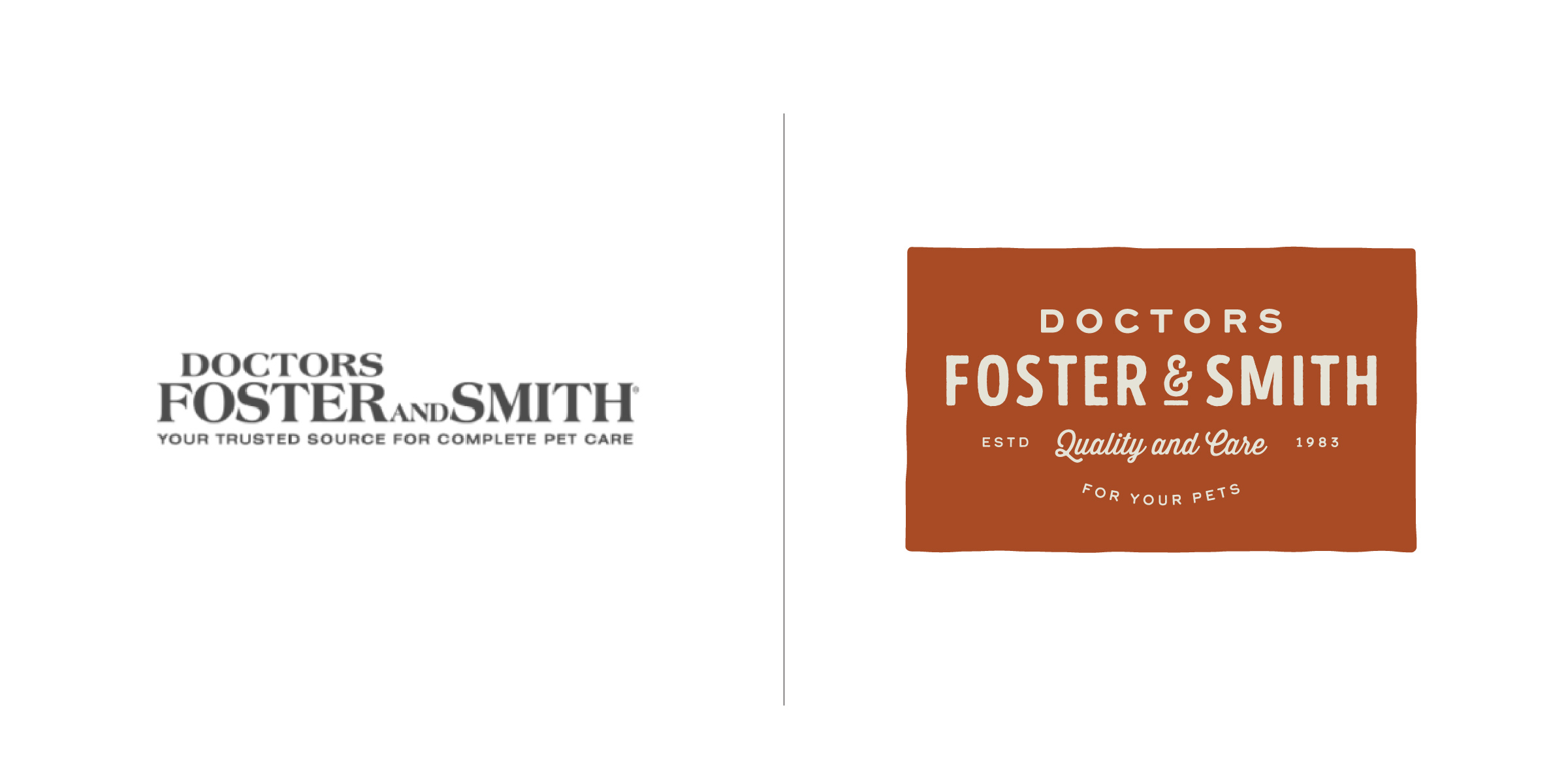
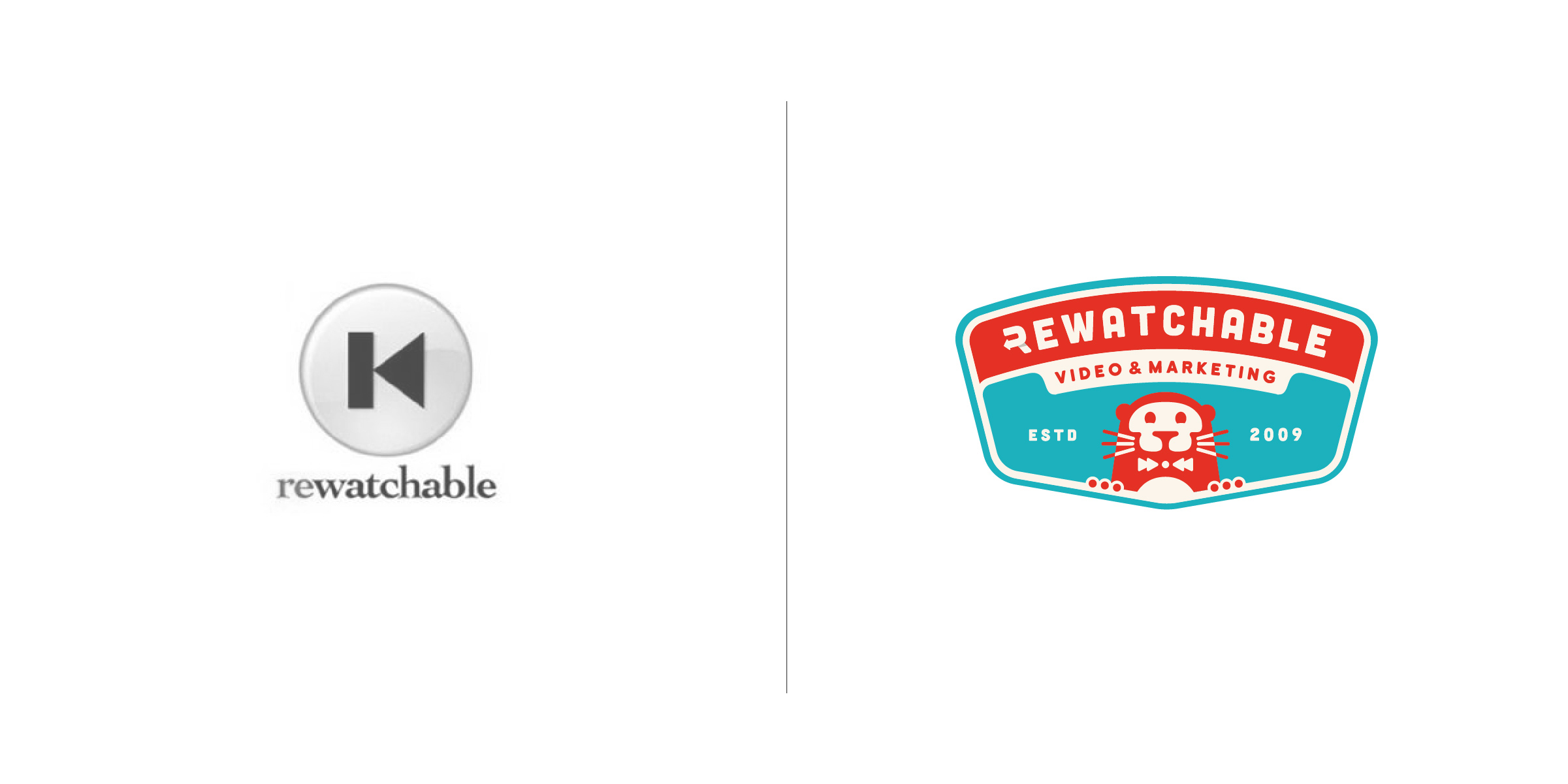
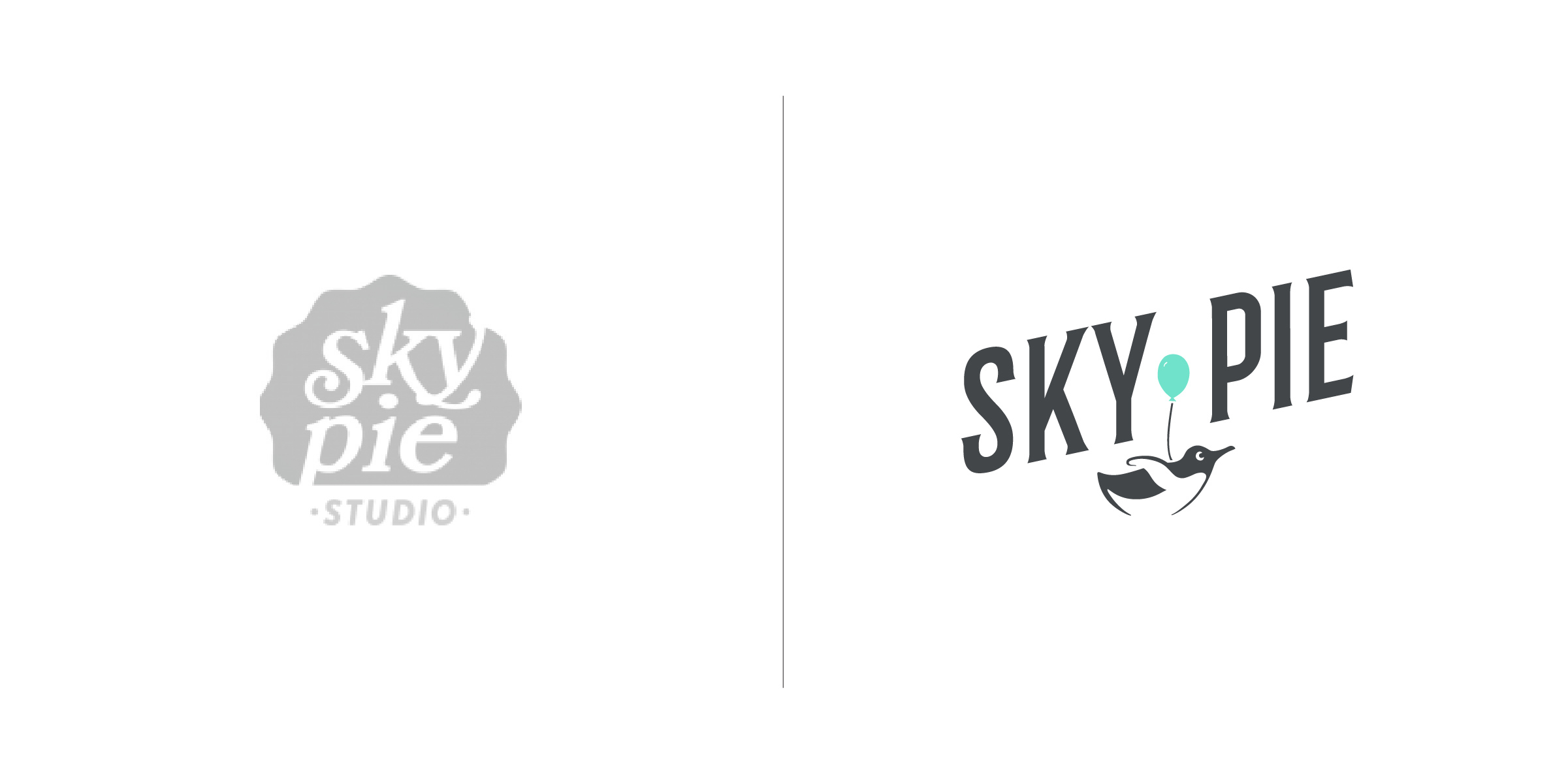
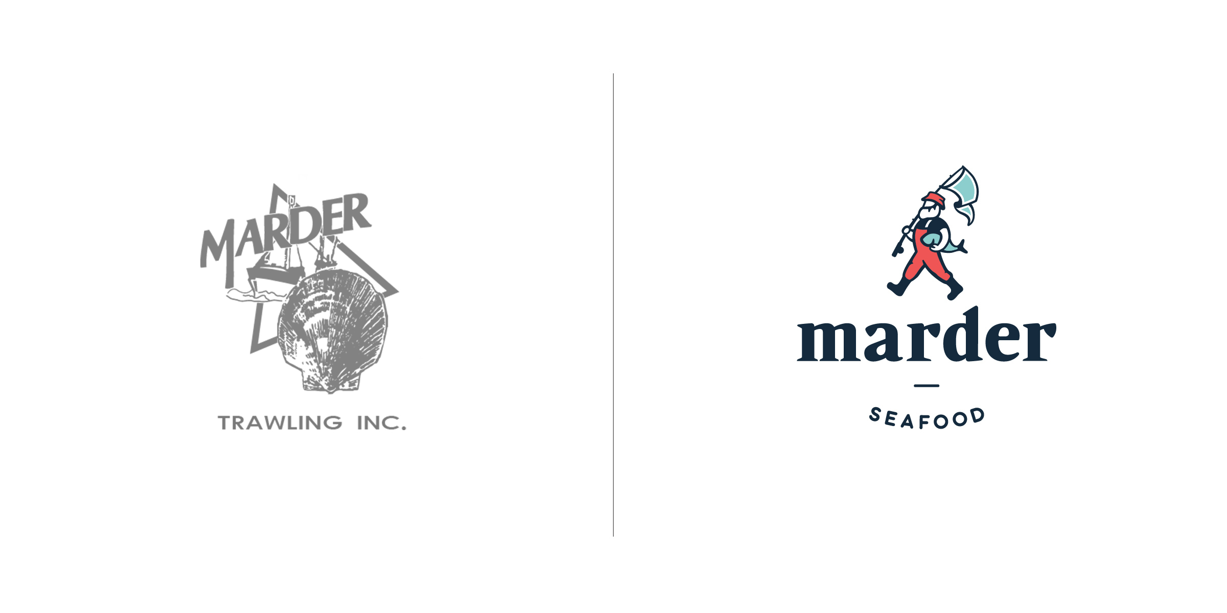
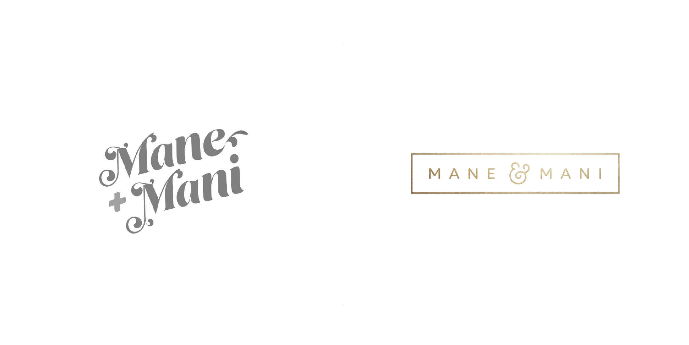
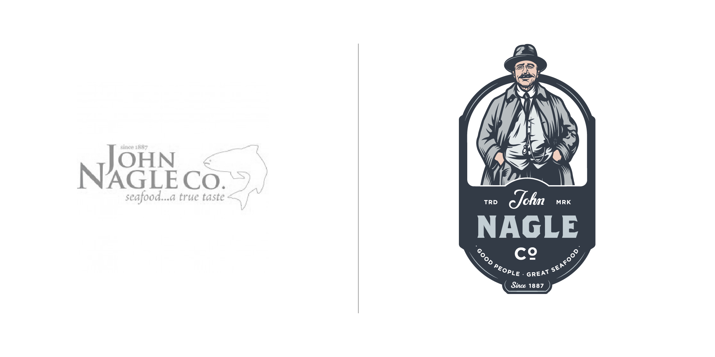
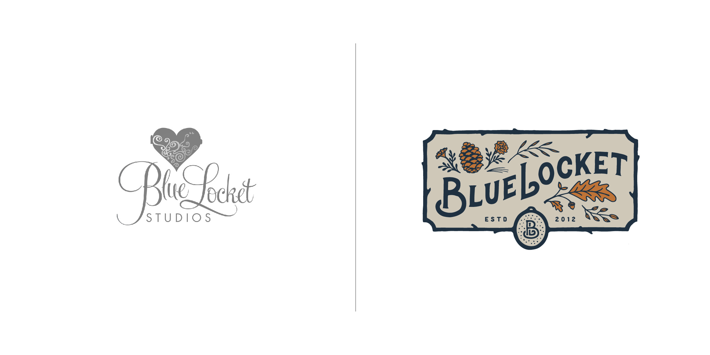
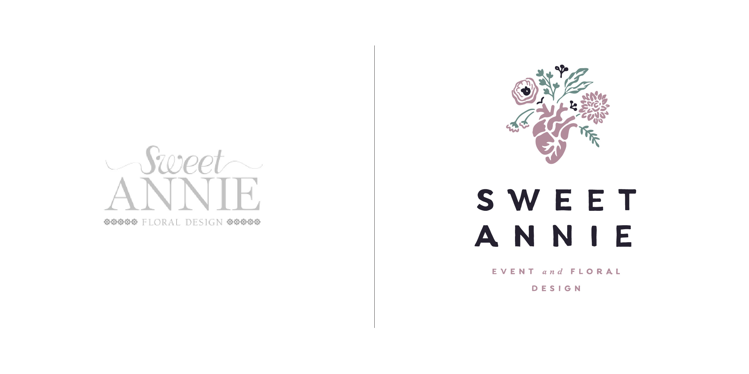
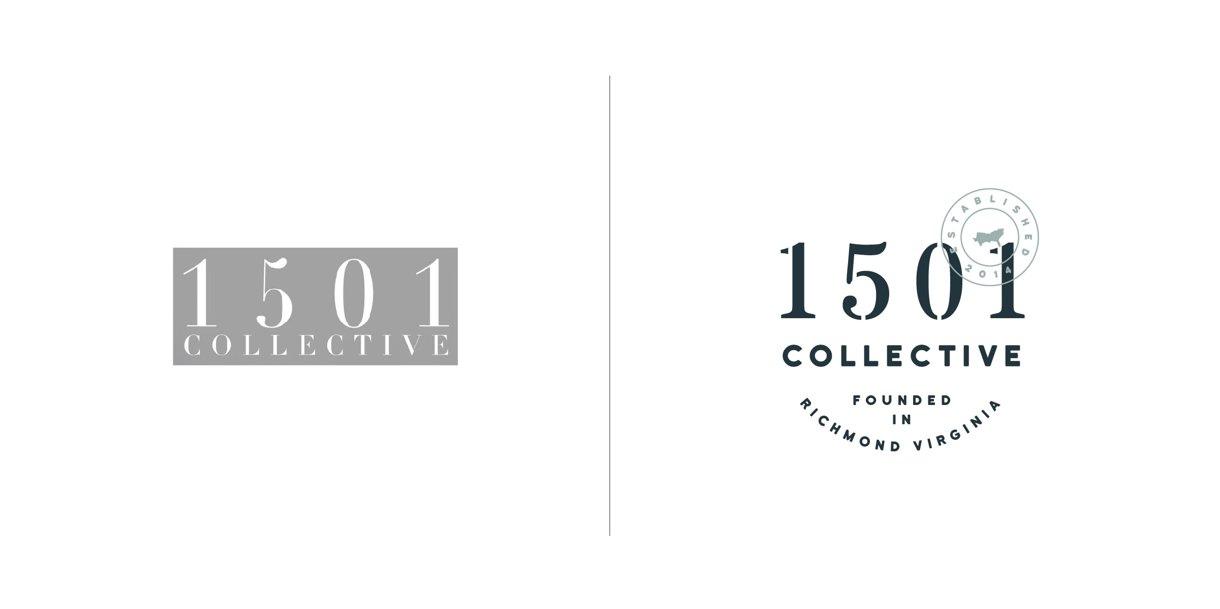
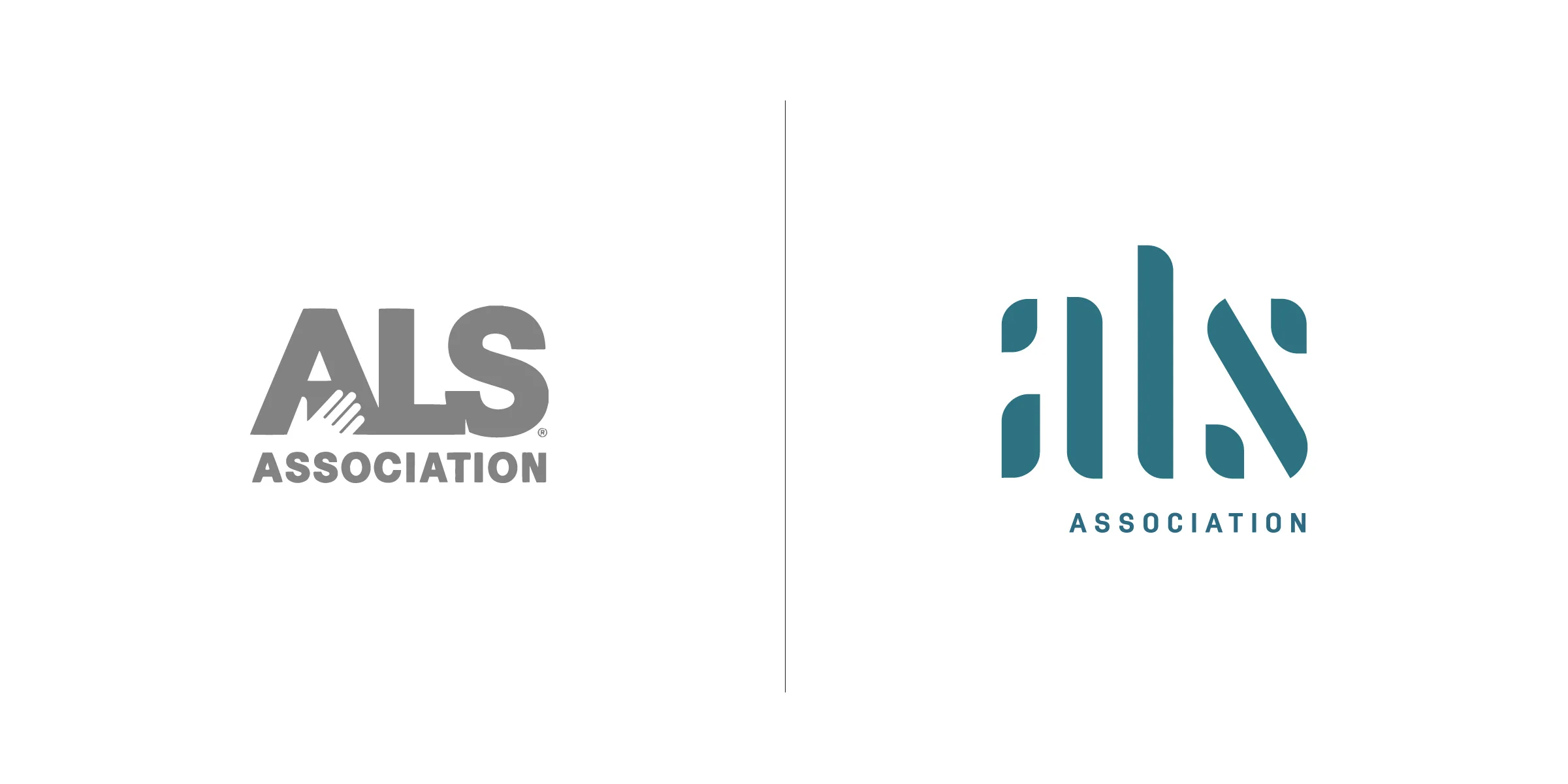
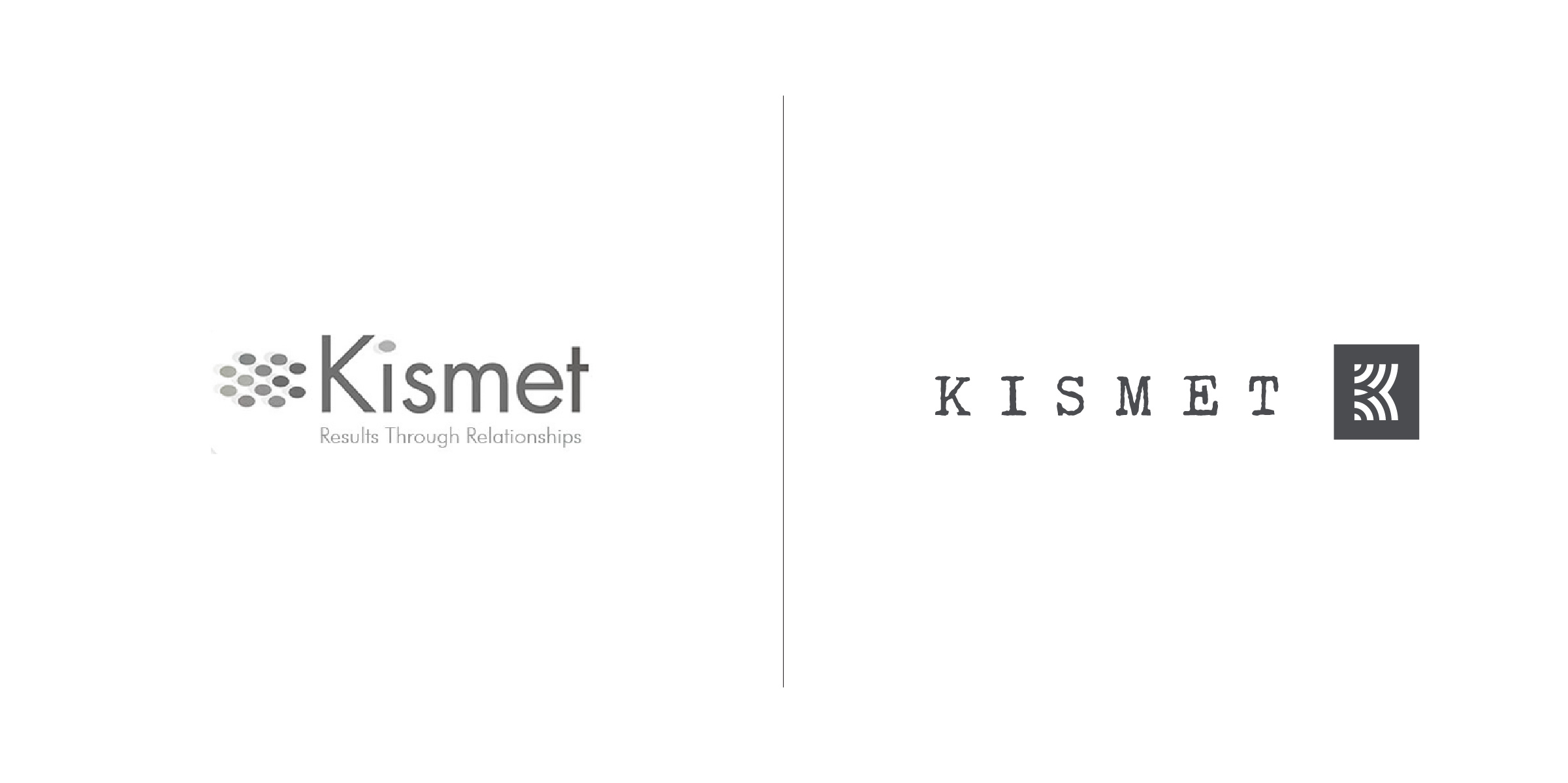
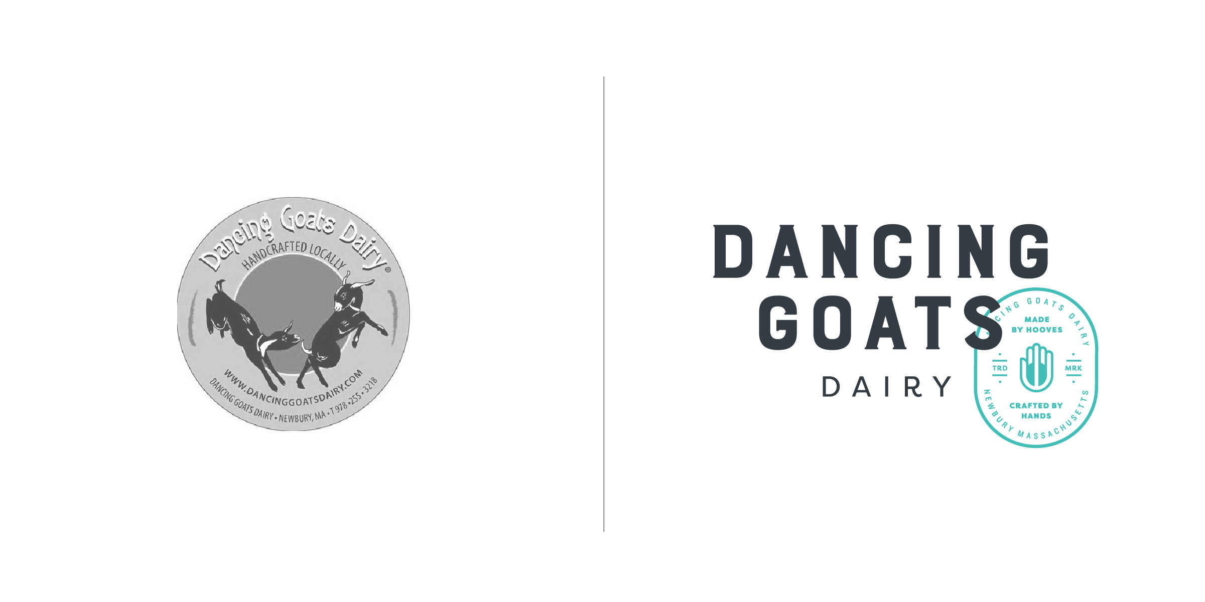
We love a good logo redesign.
Our specialty is concepting, reinvigorating, and restoring logos for new & established brands—enhancing their style and legibility through refinements (and sometimes, dramatic updates). In addition to updating existing brands, we love collaborating with designers, agencies, and in-house teams to create new logos or consult on logo development.
Considering a refresh? Here are a few questions to ask yourself:
Has your business expanded or changed?
Do you have new competition?
Are you speaking to a new audience?
Have your brand’s values or mission changed?
Is your logo dated?
Are you embarrassed to show it off?